Sunday, 13 December 2015

Image Manipulation Process

From the photo shoot that I did with Charlie or 'Maverick', I edited the 22 that I kept and recorded the editing process using an application called Quick Time and then the video itself was edited using iMovie, speeding the video up 6000%.


A brief explanation of the editing process.


I opened the 22 selected photos and opened them in camera raw, where I then altered all of the elements on the right of the screen, such as the exposure, contrast, saturation, etc.

When I had finished altering the photographs in camera raw from the application Bridge, I then changed the file from JPEG to RAW, due to when I originally opened them in camera raw. Then once the 22 photographs were altered, I selected all of them and opened them in Photoshop.

I used the crop tool on some of the photos, so that the framing was more appropriate.

I applied a few quick adjustments to each of the photos, like auto tone, auto contrast and auto colour. This would just generally improve the quality of the image.

I altered the input and output levels on each of the individual photos.

I also used the spot removal tool on a few of the photos, to remove some parts of the image that I didn't want. A good example of this is that one of the strings on the guitar was broken, so I had to remove the loose string on several images.


Saturday, 12 December 2015

Images Taken

Over the process of creating my media product, I overtook a total of 3 photo shoots, each with different models to appear in my music magazine. Each of the models that I used during the photo shoots, I would consider to appeal to my target audience and their ideologies rather effectively.

Monday, 23 November 2015

Feature Story Ideas

After researching some music magazines, particularly those that feature indie rock artists, I found out that most of the feature stories are about a relevant artist. The articles give content, or 'exclusive content', or news stories about these artists. The main article in a music magazine usually focuses on the artist which features on the front cover of the magazine. With these things in mind, I have come up with some feature story ideas which I think would appeal to my audience and therefore could be included in my magazine. I have found some examples of feature stories within magazines which could be similar to what I would use on my final design of my magazine.


  • Top 10 tribute bands you should hear.
  • Exciting, upcoming musical events in your area.
  • 20 new indie rock bands you'll love!
  • Exclusive behind-the-scenes pics of Tales of The Poncho's new feature film.
  • Live performances you cannot miss in 2016!
  • The 10 most important gigs this month!
  • Frankie Smith's new album.

Final Colour Scheme

I have decided to choose this as my final colour scheme as it is the most conventional of all the original colour schemes that I created. These colours are used very often in magazines like NME and Q, which are associated with the Indie Rock genre.


Colour Scheme Ideas

Here I researched a whole load of different ideas for the colour scheme of my magazine. My two main focuses was that the magazine has to look visually appealing so the colours must compliment each other well. My second focus was to look at other existing magazines of a similar genre to see what colours they often use and what colours are conventional to the genre.

ramp.jpg (400×151)


Swatch.jpg (4928×3264)colour-swatches.jpg (2353×1764)


Sunday, 22 November 2015

Final Name Design

This is the final design for the name of magazine. I have chosen it as I think that it will be visually appealing to my audience and it will become very recognisable. It also represents a good understanding of the iconic colours and fonts of the indie rock genre.


Name Ideas


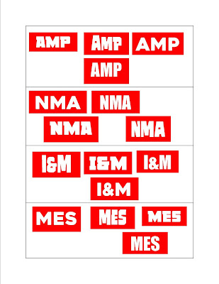
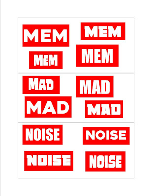
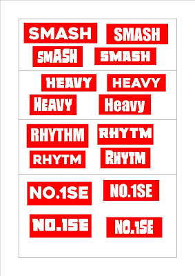
For the name design of my magazine, I have took ideas from some of the leading rock magazines in the UK. Their designs predominantly follow red, white and black colours, as this is iconic and conventional to the genre. Here are some images of the examples which I have took inspiration from, including different variations of the NME logo.


The name of my magazine will follow the red/white/black colour scheme, iconic to the indie rock genre and used in NME, Q and MOJO magazine. It will also be in a bold font, so that it is easy recognisable to the audience. A lot of the artists logos have an unusual or disorientated look to them also, which I have chosen to interpret into my own magazine.

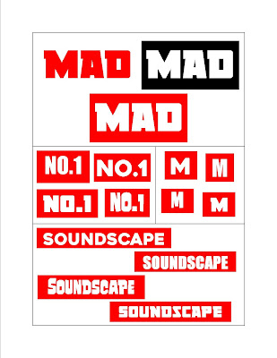
I chose three similar colour schemes with the magazine name, which of course will be used as the masthead, so it is very important that it stands out and is easy recognizable. I will of course decide which the the three colours I will use when it comes to my final design of the name/masthead.

I then chose four different fonts and have presented each of the fourteen names which I though of. It is important that the name design looks visually appealing to my audience, so it is important that I take this into a lot of consideration. I presented them in this way so that I can see the great range of different options available and will then decide on the final name design, which I will then decide on a final name design.


Saturday, 21 November 2015

Prop Ideas

As my magazine is a music oriented magazine, based on the indie rock genre, why not have the subjects within my magazine using music and musical instruments as props. So, a subject within my magazine, might be pretending to use a guitar, a microphone, a keyboard, or a drum kit. They could also be holding a sample of indie rock music which is relevant to the articles written in the magazine. For example, if my magazine had an article on the Arctic Monkey's new album, AM, then one of my subjects could be holding that album or vinyl in the image. However the props don't necessarily have to be musical, it could be as simple as an umbrella or a camera. Often a magazine plugs a give-away or a competition of some kind, to which then the prize is used as a prop.

d_img.jpg (570×380)4538_Fender_American_Vintage_57_Stratocaster_2TS_Left_Handed_V198394_1.jpg (800×1136)
ukulele-e1321391838252.jpg (638×425)e8473745e6eecbfda4cda59717471942.jpg (500×375)
SennMicrophone.jpg (1161×777)1400254260Oxford_piano_7.jpeg (3008×2000)
Terry_Bozzio_drums.jpg (640×480)67629.jpg (1280×1024)
tumblr_lvcgqgQ7Wp1r59pjho1_1280.jpg (1280×960)x354-q80.jpg (354×354)


Monday, 16 November 2015

Mise-en-scene Location Ideas

For this, I have thought of some of the locations which might be associated with someone who listens to indie rock music, or perhaps music in general. These are locations that my readers will enjoy visiting, for business or leisure.

A decent percentage of my readership are students, so they will likely be attending university, college, or even school, however I wouldn't expect very much of my audience to still be at a school age, so university or college are more likely.

C5BE54_2262745b.jpg (620×388)opendays_header.jpg (421×231)
image5.jpg (1698×1131)wyke-college.jpg (773×589)


Something that is hugely associated with the indie rock genre is music events, like gigs and festivals. The audience of my magazine will likely be attending these events very often, perhaps even every week.

reading festival_4.jpg (675×377)T_in_the_Park_Festival_2010.jpg (2048×1536)
leeds-stage.jpg (487×340)v.jpg (600×420)

My audience will obviously be interested in music stores, as this is were they will purchase all of their musical needs, like albums, singles, CDs, vinyl's, as well musical equipment such as guitars, drums, keyboards, headphones or amplifiers. However, the amount of music stores there are available is slowly decreasing, as things like iTunes or Spotify are becoming increasingly popular, because of the convenience of having all of your music collection being on your phone or PC, rather than being scattered around the home.

hmv-store.jpg (900×708)21232200.jpg (400×300)
reading-store-right.jpg (426×234)shop1.jpg (2160×1440)