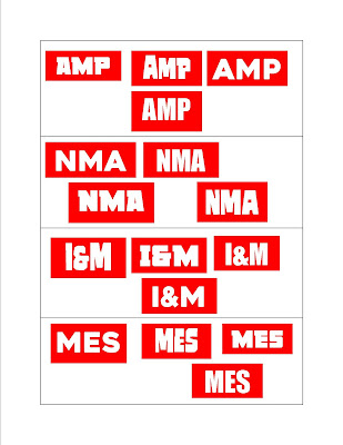
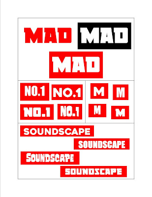
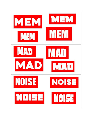
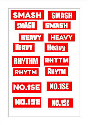
For the name design of my magazine, I have took ideas from some of the leading rock magazines in the UK. Their designs predominantly follow red, white and black colours, as this is iconic and conventional to the genre. Here are some images of the examples which I have took inspiration from, including different variations of the NME logo.
The name of my magazine will follow the red/white/black colour scheme, iconic to the indie rock genre and used in NME, Q and MOJO magazine. It will also be in a bold font, so that it is easy recognisable to the audience. A lot of the artists logos have an unusual or disorientated look to them also, which I have chosen to interpret into my own magazine.
I chose three similar colour schemes with the magazine name, which of course will be used as the masthead, so it is very important that it stands out and is easy recognizable. I will of course decide which the the three colours I will use when it comes to my final design of the name/masthead.
I then chose four different fonts and have presented each of the fourteen names which I though of. It is important that the name design looks visually appealing to my audience, so it is important that I take this into a lot of consideration. I presented them in this way so that I can see the great range of different options available and will then decide on the final name design, which I will then decide on a final name design.


No comments:
Post a Comment